Video Express Website
Krannert Computing Center // Redesign Case Study
What is Video Express?
Video Express is a series of self-service recording studios at Purdue University that enable faculty and students to record high-quality videos. This is made possible through the combination of a website and tablet application.
Demonstrating the problem: User interviews
In our informal interviews, we urged our users to tell stories about the holistic Video Express experience.
- Most users had an overall good or neutral opinion of the options the website offers
- When describing their whole experience, most users left out utilizing the website
- Once asked, all users remembered at least one negative interaction they had with the website
Throughout the process of the Video Express redesign projects, we had been practicing the process of Continuous Discovery, a book by Teresa Torres. Part of this process is creating Interview snapshots from every interviewee with the main takeaways for quick reference.
We made quite a few aesthetic and functional changes to the Video Express website. I will group them into three main user needs: Contextual Guidance, Room Option Clarity, and Seamless Video Management. Note that all my new designs have been created with a mobile design consideration.
Contextual Guidance
To help users understand their next steps clearly- rather than having to know exactly what tab to click at what time.
The first, biggest thing we don’t want the website to be overlooked anymore- we want it to help highlight all the good that Video Express does for users. Our first consideration is to integrate the website with the overall experience with the help contextually guided home page.
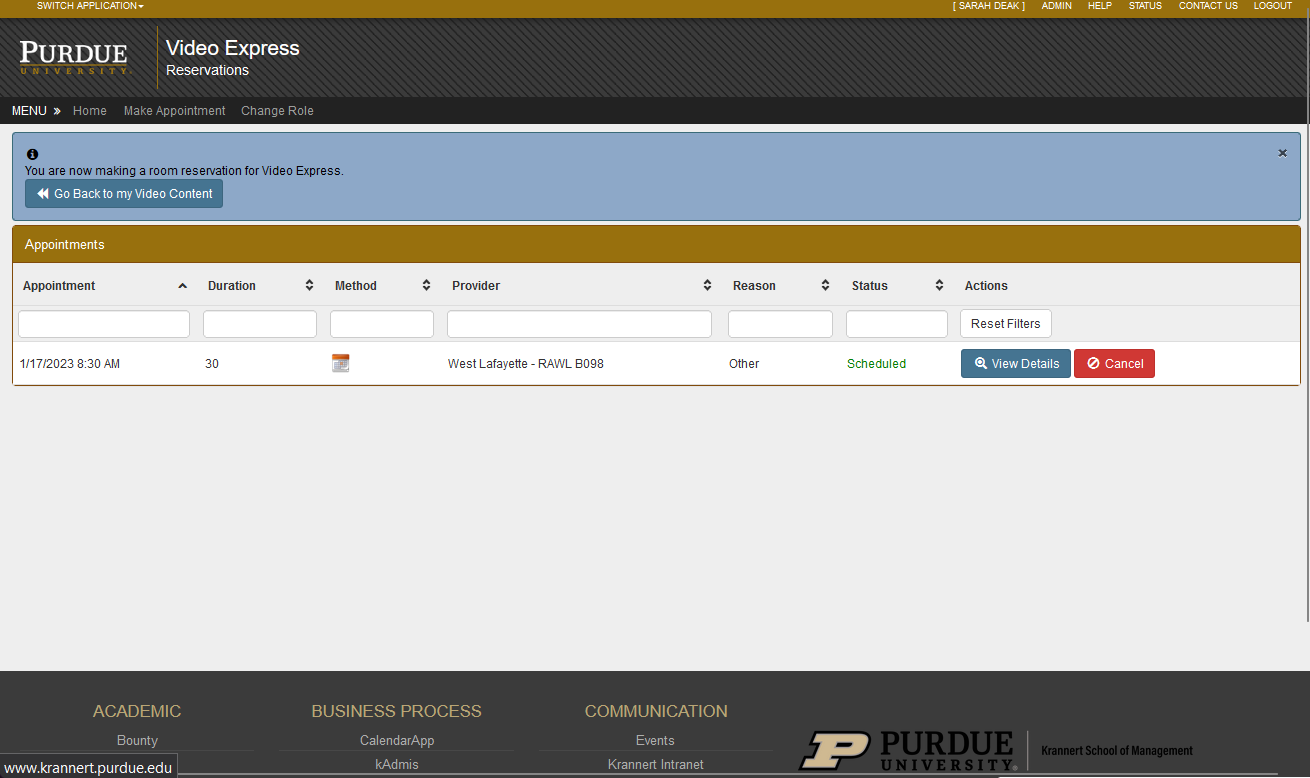
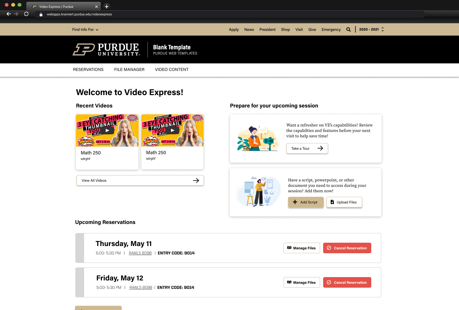
The old upcoming reservations page only showed the upcoming appointments. The newly designed page shows users other relevant information- each of these sections will be displayed at certain times during the lifecycle of a VE appointment.

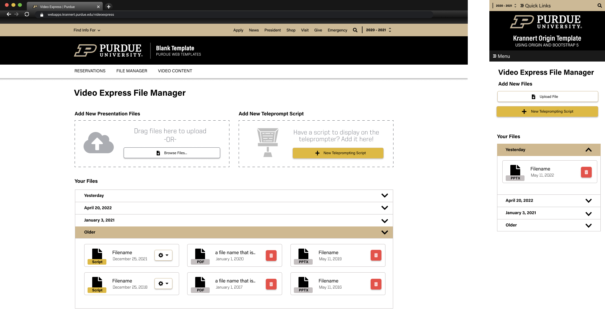
Many users didn't realize that teleprompting files needed to be uploaded before attending the appointment. Now, upon creating an appointment they will now be prompted to upload their teleprompting or presentation files.
Room Option Clarity
To give our users clarity to know that not every studio is exactly the same.
We heard many times in interviews something along the lines of “The rooms are really inconsistent with what hardware they will have.” or, “I wish the studio had a different type of mic, chair set up, etc.” which are options amongst the different rooms.


Our updates help guide the user to choose the room that best suits their needs. In order to create a reservation, they first must choose what studio they want to reserve. This list allows them to filter by what sort of mic, setup, et cetera they need to be successful.
Seamless Video Management
To improve the user’s ability to organize their content.
While most of our interviewees didn't have too many things to say about the video management system, we did find that the actions they took did not necessarily align with the way the content page is currently designed.

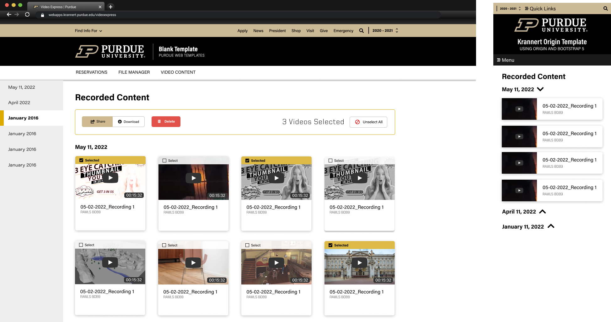
Our users tend take a lot of videos, so we wanted to decrease the mental load of the page by simplifying the video previews & metadata, and allow them to bulk manage videos.
