Video Express Tablet
Krannert Computing Center // Redesign Case Study
What is Video Express?
Video Express is a series of self-service recording studios at Purdue University that enable faculty and students to record high-quality videos. This is made possible through the combination of a website and tablet application.
Discovery & Understanding: Heuristic Evaluation
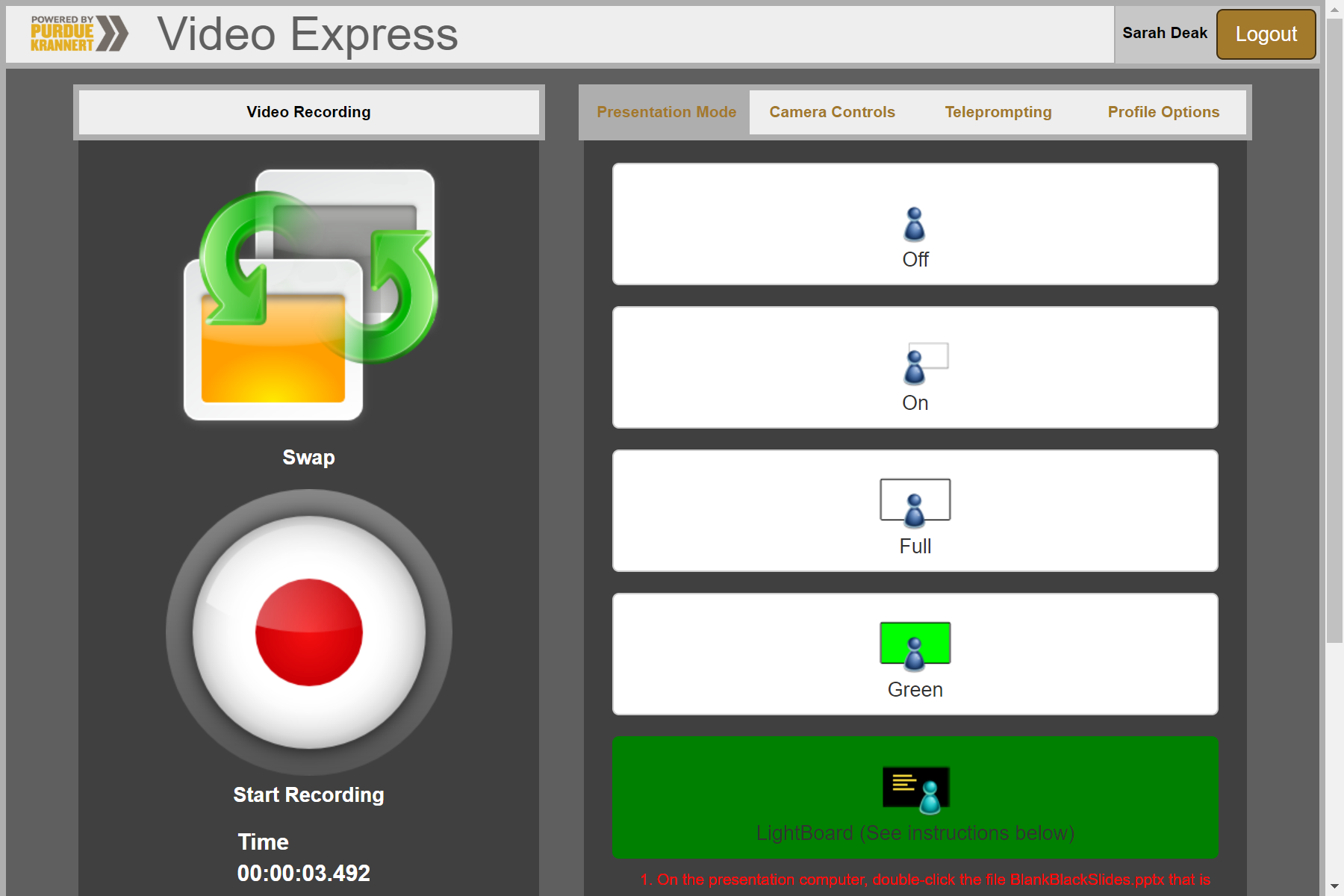
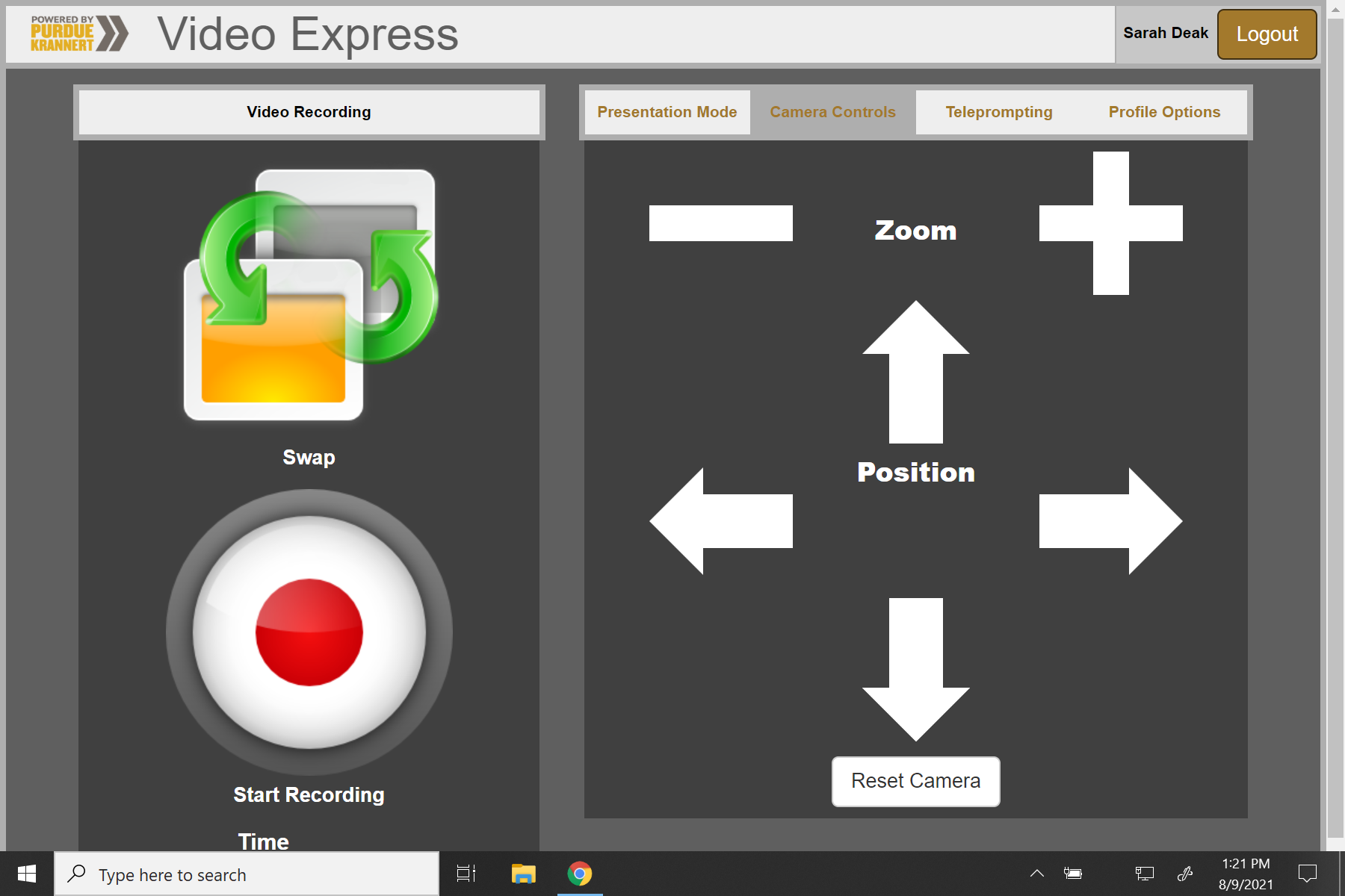
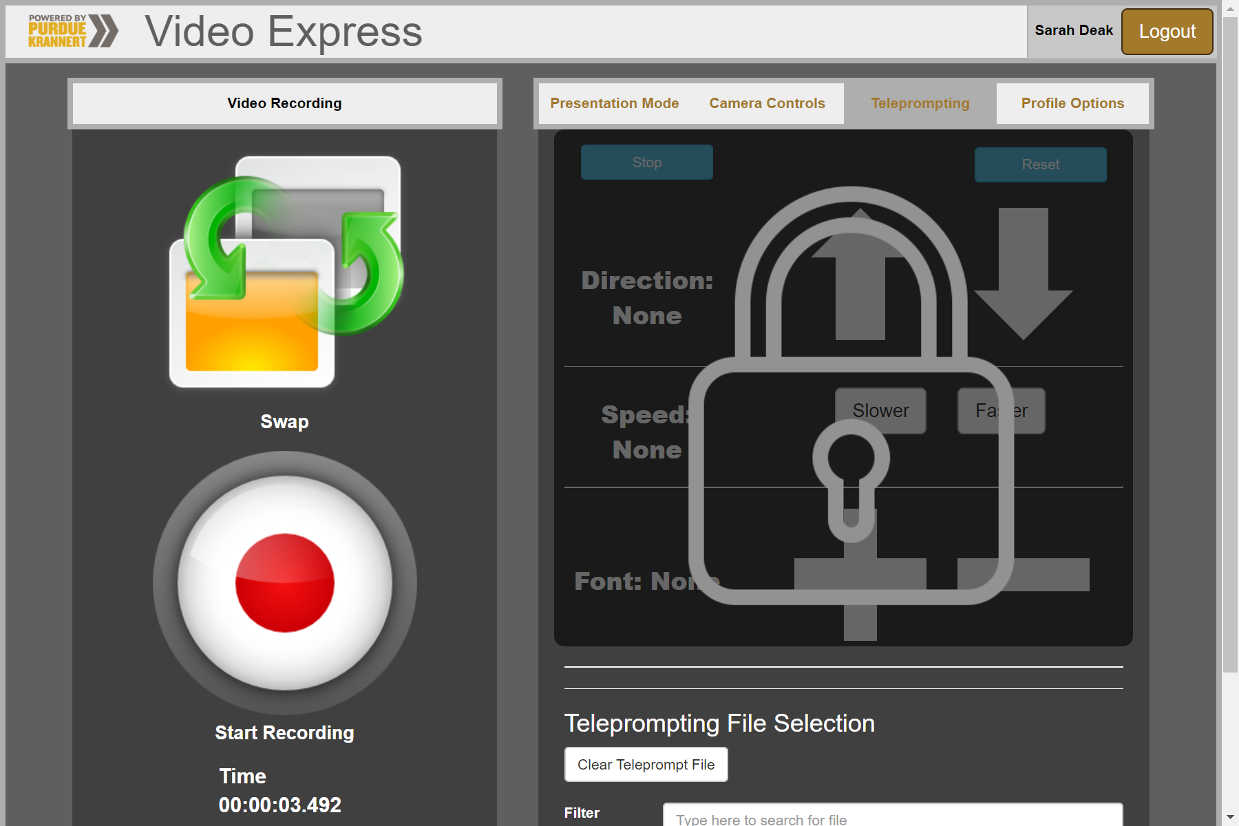
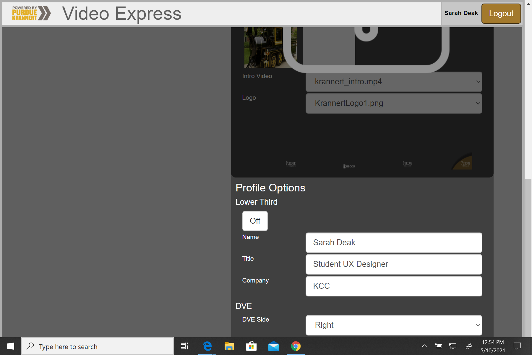
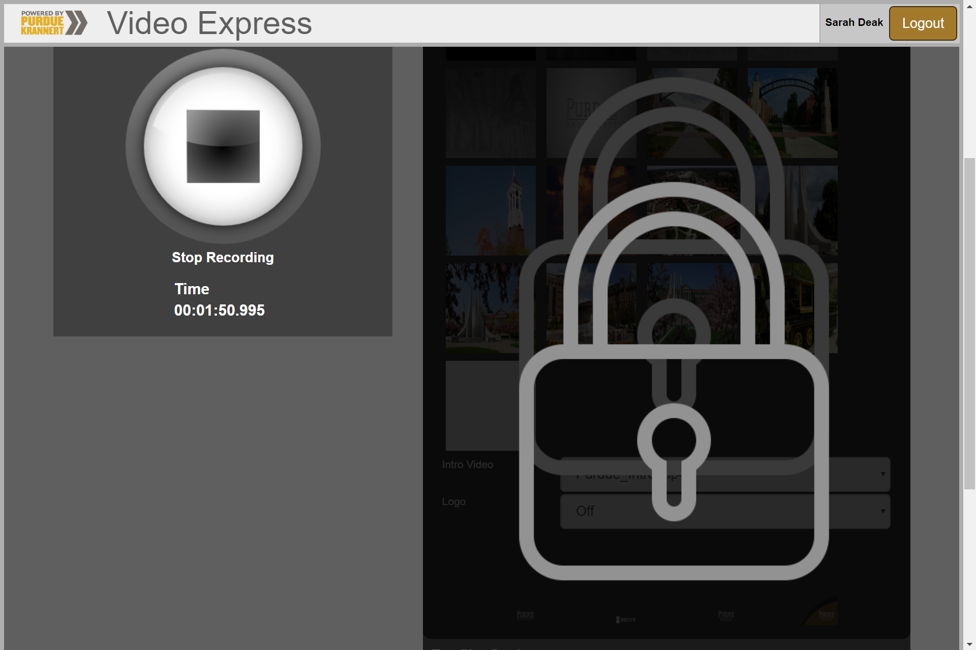
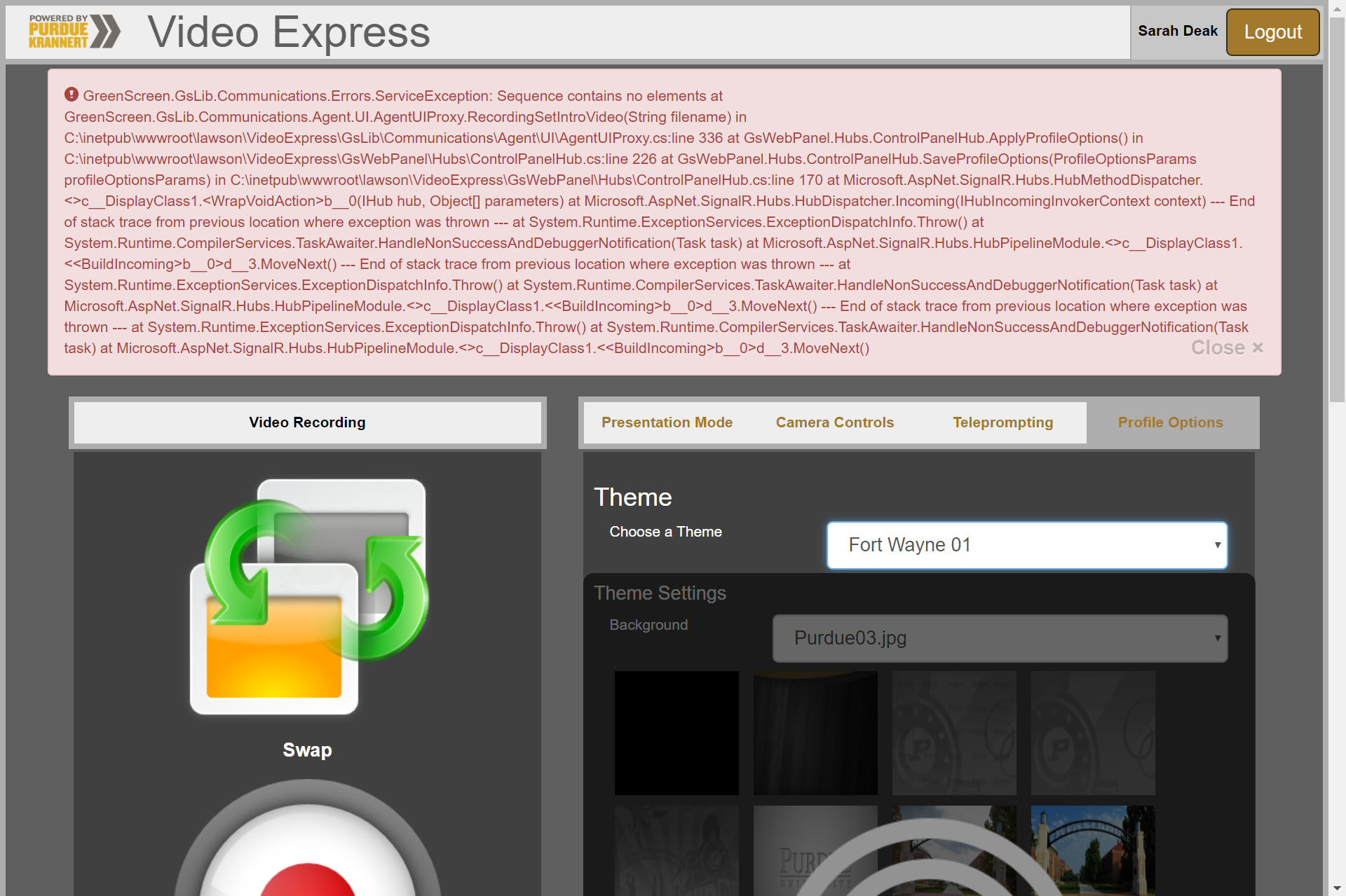
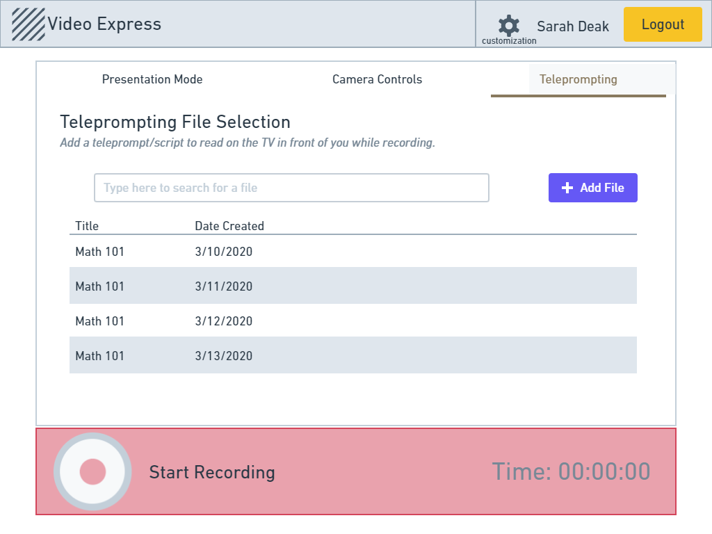
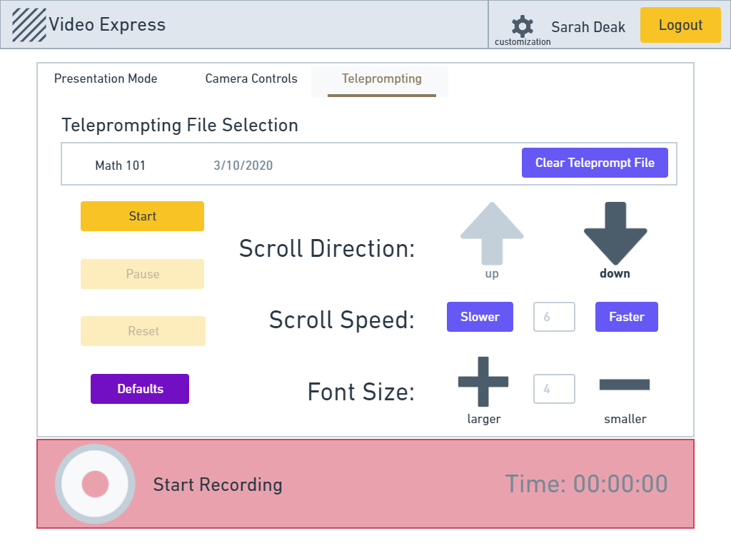
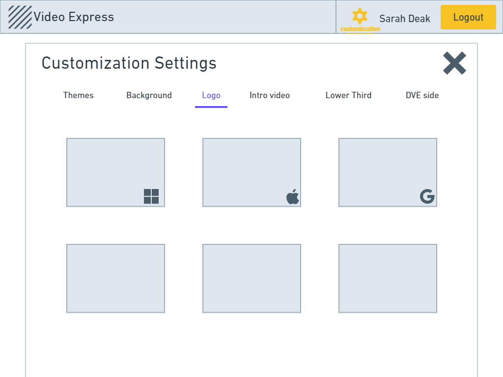
To familiarize myself with the app as well as kickoff the redesign, I conducted a heuristic evaluation of each page of the current app design. Below, you can see each page of the original Video Express application.
Key Heuristic Takeaways:
Demonstrating the problem: Usability Testing
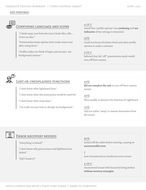
Next, I brought in five new users to Video Express to get further insight into issues such as navigation, language, and feature discovery. The insights and results of these tests are demonstrated in this infographic, which I created using Figma.

Key New-User Pain Points:
Language and icons used to describe buttons within the tablet application do not accurately convey their function.
“Profile makes me think of login and account, not background options.”
Many functions are lost to users due to application layout as well as lack of explanation.
“I’m really not sure how to change my background.”
Users need clearer ways to recover from errors.
“Did I break it?”
“Everything is locked?”
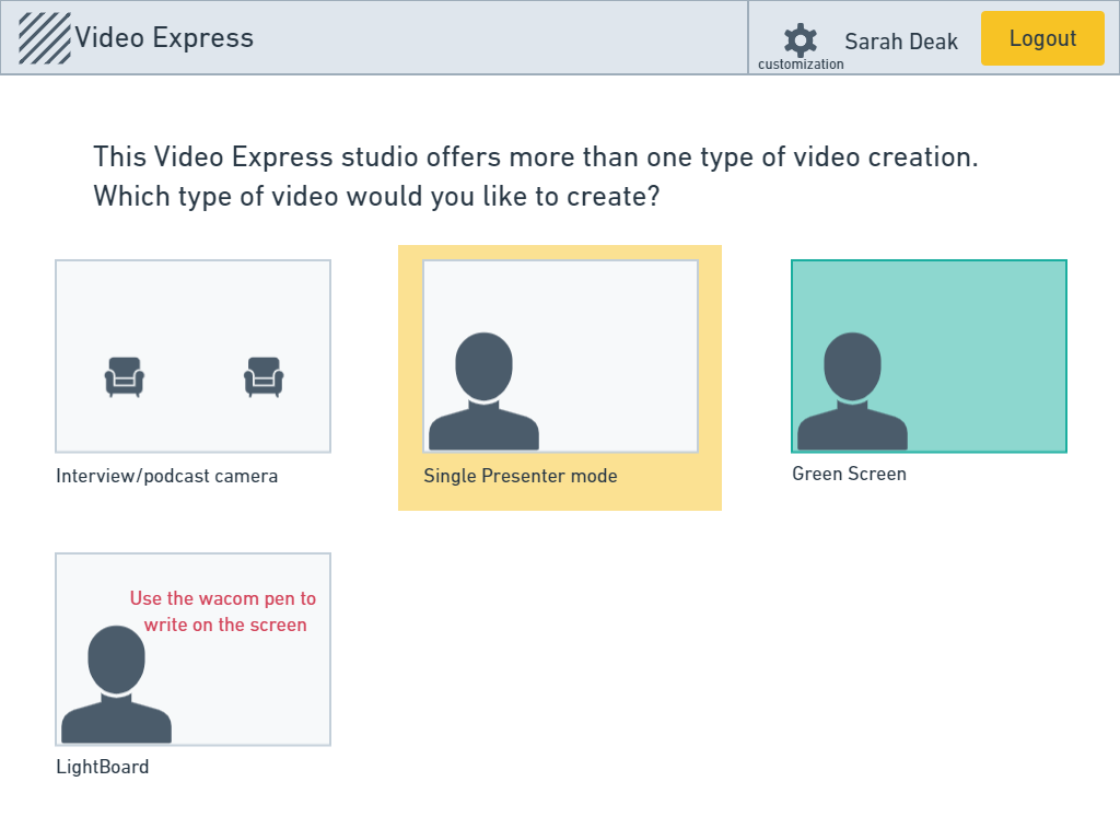
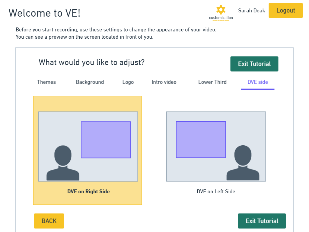
I then pitched the redesign to the Video Express team. I brought my initial ideation screens created in Whimsical to demonstrate possible directions and visually reflect the main changes to be made to the app layout. These wireframes are shown in the slideshow below.
Refining Stage: Hi Fidelity Prototypes
After gaining approval for a redesign and gathering further requirements, I refined my wireframes and created hi fidelity mockups to be used for evaluation.
Key Changes Made:
Evaluating Design Changes: Usability Round 2
I am currently in the process of conducting round 2 of usability testing. This will be conducted with 5 new users and 5 seasoned users of Video Express. This test consists of the same tasks as the first round, and the results will be compared in order to evaluate the new design.
